Financial News App
Case Study | UI/UX Design | Prototyping | Design System
A large financial firm needed an app to aggregate all its financial online articles, social media posts, and podcasts for its extensive client base to access conveniently.
Duration
Roles
6 Weeks
UI/UX Designer | Usability Tester
Tools
Figma | Microsoft Suite | Adobe Suite | Google Material 3
Responsibilities
Wireframing | Prototyping | Usability Studies | Iterating on Designs

Challenge
Clients of the financial firm need a convenient way to access company posts that is accessible and intuitive to users of varying levels of digital literacy.

Solution
Create an app that aggregates company posts onto one platform and has limited menu options and easy-to-access accessibility features.
User Research

Summary
I spoke with client-facing employees and the marketing team to better understand our client’s frustrations with accessing company posts across multiple online platforms. I also got a better understanding of our target demographic and their general comfortability with using mobile applications. They helped me build user pain points and a persona based on existing user research.
Pain Points

Many Platforms
Clients need help keeping up with the many different platforms the company offers.

Consistency
Navigating multiple platforms presents unique learning hurdles for clients due to varying features and layouts.

Noise
Some websites have feeds that contain irrelevant content and ads, which can confuse and distract clients.
Defining the User

Persona: Meet Earl
“I want to be regularly informed of current market activities and how my money manager interprets them.”

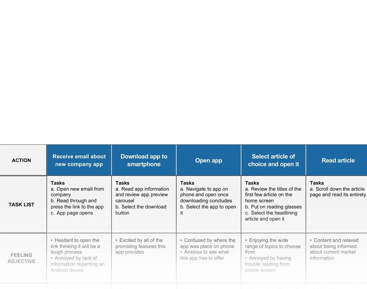
User Journey Map
Mapping a typical client’s journey helped identify potential pain points that may arise for the users.

Design and User Testing

Paper Wireframes
The app's most important screen is the home feed, aggregating articles to create a news feed-style interface. The feed features the company's latest articles. This screen was the focus of my wireframes.

Digital Wireframes

Article Feed
The company wanted the article feed to resemble typical news app feeds, with a prominent article at the top.

Social and Podcasts
Having familiar, clean, and easy-to-navigate social media embeds and podcast sections was important.

Saved Articles
One of the app's most significant benefits is the ability to save company articles for later reading.
User Testing
Low-Fidelity Prototype
After approval of the digital wireframes, a low-fidelity prototype was created and shared with the company.

Usability Study
I shared the low-fidelity prototype with a select group of individuals within the company, ranging from employees on my team to those who frequently interacted with clients. I provided them with prompts and asked them to interact with the prototype. While I cannot offer the original study, I will summarize the results below.
Key Insights from Study

Added an increase-font-size toggle at the top of every article for accessibility.
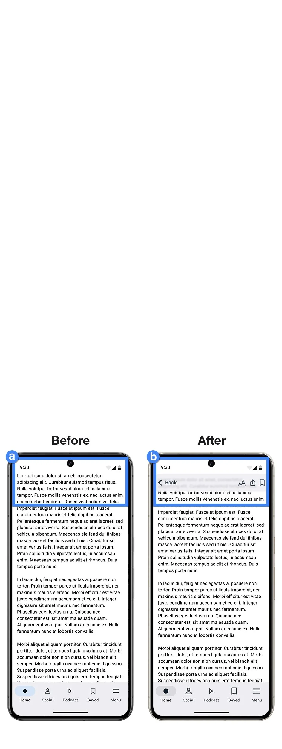
The article page's top bar now remains fixed for easy navigation.

The "Notifications" and "Display Mode" options have been reorganized and converted into toggle switches.
Refining the Design
High-Fidelity Mockups and Study
After the management approved the app's functionality, features, and layout, I proceeded to create high-fidelity mockups. The mockups led to a prototype, which underwent a usability study. The company was impressed by the accessibility-conscious features and requested a demonstration of dark mode, which was successfully implemented in the high-fidelity prototype.


Final Design
High-Fidelity Prototype
This final prototype demonstrated all the main screens of the company's financial article and social media aggregator mobile app.


Impact
The creation of the prototype played a crucial role in obtaining approval from the company’s upper management. With their consent, we collaborated with an external firm to develop the app and release it on the app store. The prototype served as a convincing sales tool for the decision-makers at the firm and provided a clear guideline for the developers during the app development process.
Accessibility

The option to increase font sizes is available above every article and in the menu.
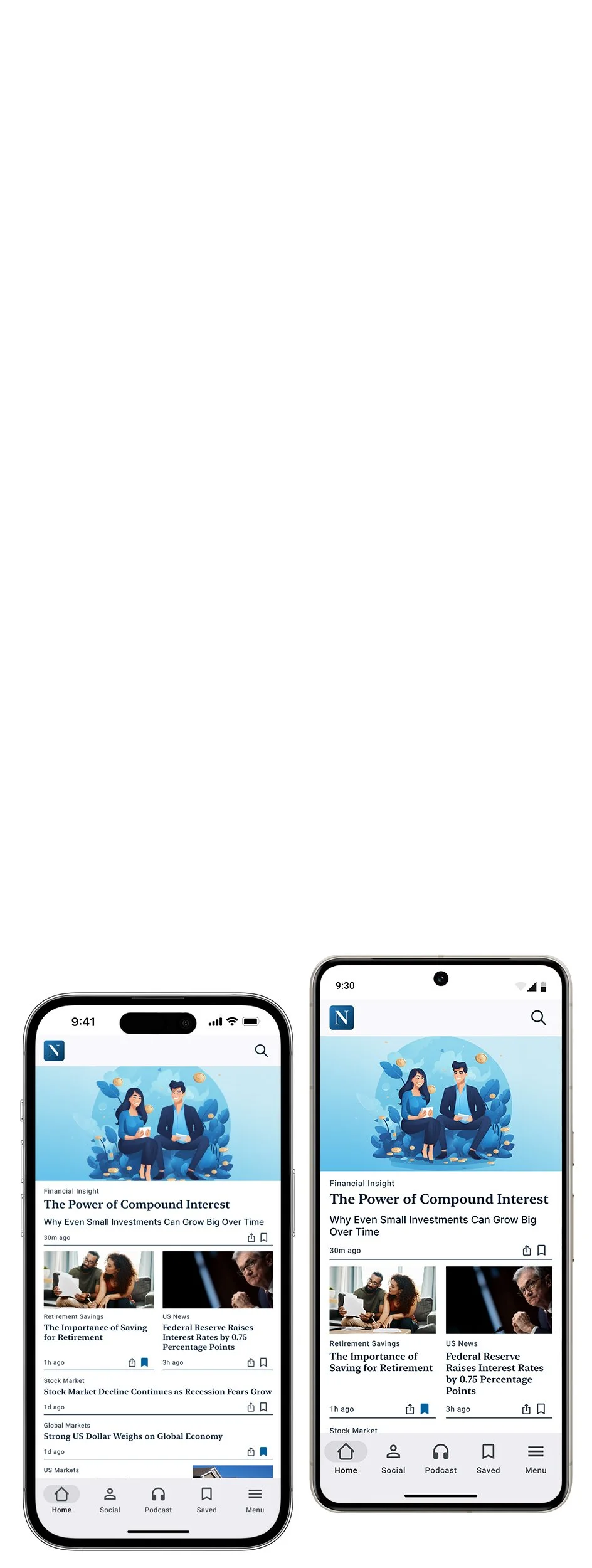
The components are designed to be responsive and can easily adapt to any screen size.

The feature of built-in dark mode has been included to help reduce eye strain.
Design System
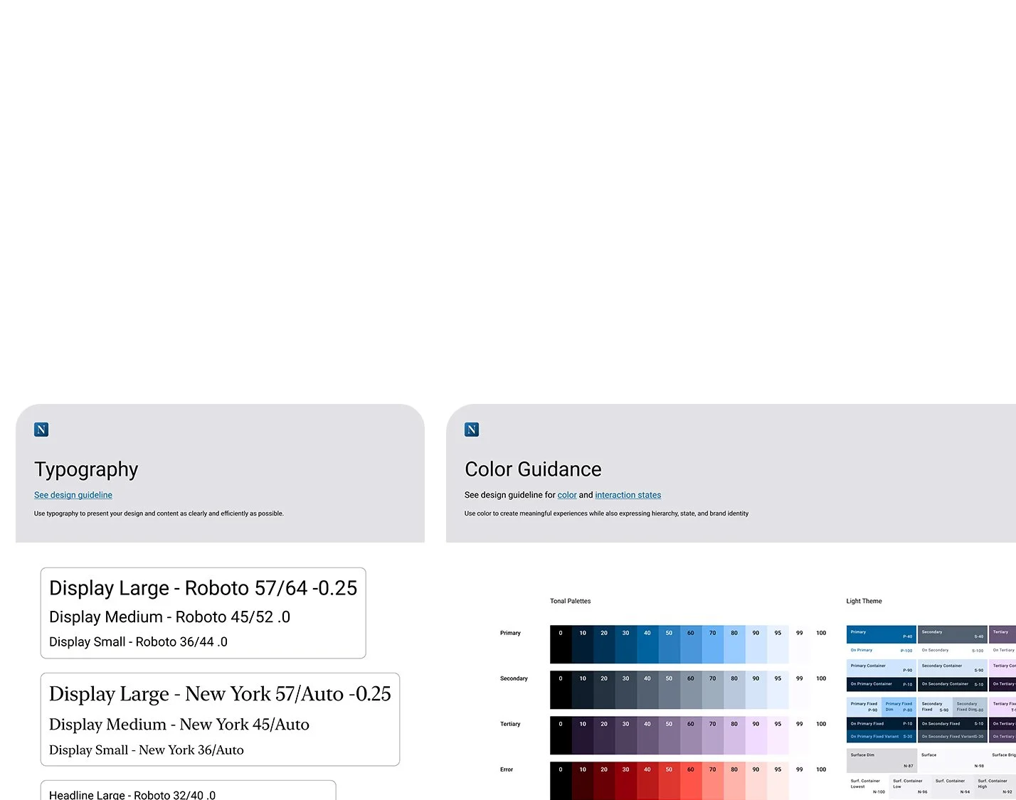
Google Material 3
Starting with the Material 3 design system improved my digital wireframing fidelity and ensured style, component, and compliance consistency.

Component Library
I organized my work and documented components for easy continuation by developers and designers.
Moving Forward

Next Steps
The company had considered adding user accounts to the app but ultimately decided against it. They opted to wait and see how much the app would be used before investing time and resources into integrating user profiles.

Reflection
By using a detailed approach that began with the user persona, I was able to maintain alignment with the company's management. As a result, I didn't need to make significant changes as I progressed into the low and high-fidelity stages. Although it took a little more time to tidy up wireframes and low-fidelity examples, it ultimately proved to be an efficient approach.