Vacation Rentals Website
Responsive Website | UX Design | Prototyping | Design Kit
A vacation rental business requires a website update with improved responsiveness and new search/booking features.
Duration
Roles
4 Weeks
Website Designer | UX Designer | Researcher
Tools
Figma | Microsoft Suite | Adobe Suite | Google Material 3 | Google Bard
Responsibilities
Wireframing | Prototyping | Iterating on Designs | Competitive Research
Challenge
Drake House wants a viable alternative to their Airbnb and Vrbo accounts for guests to book one of their rental units. They want this website update to have a responsive design and fast checkout flow.
Solution
Design a responsive website that allows users to search for rental availability, evaluate the room details, and book directly through the website using a single-screen checkout.
User Research
Summary
I collaborated closely with the property manager and owner to understand the advantages of updating their site with a new online booking feature and how it would appeal to customers. Additionally, they provided user information that facilitated the development of pain points, personas, and journey maps.
Pain Points
Expense
Relying solely on Airbnb or Vrbo for bookings incurs growing costs.
Responsiveness
The website needs to be more responsive and can be challenging to navigate on certain devices.
Management
Double bookings can occur because the site doesn’t communicate with other booking platforms.
Defining the User
Persona: Meet Samuel
Samuel, a hard-working father, prefers booking local vacation rentals directly to avoid the hassle and cost of large peer-to-peer sites.
User Journey Map
For this user journey, the goal is to search for and book a vacation rental from the Drake House website.
Competitive Audit
I compared the ease and cost of booking a stay with four booking sites in the same location as Drake House. Google Bard was leveraged to pull detailed information.
Design and User Testing
Sitemap
When designing the sitemap for Drake House, improving and simplifying the user flow from site entry to booking screen was a top priority.
Paper Wireframes
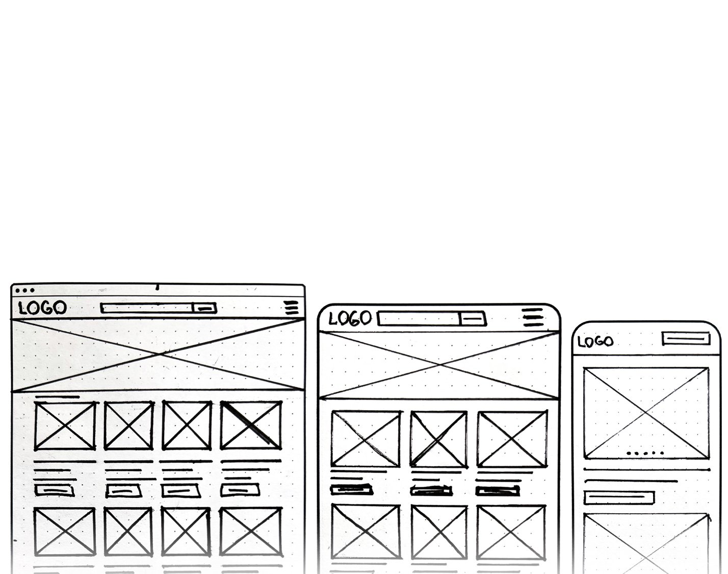
For the redesign of this site, agreeing on the home screen layout was crucial. Once established, I adapted it for smaller screens.
Digital Wireframes
Booking Bar
Drake House requested a booking bar at the top of the page. I expanded it to full-screen for mobile browsers.
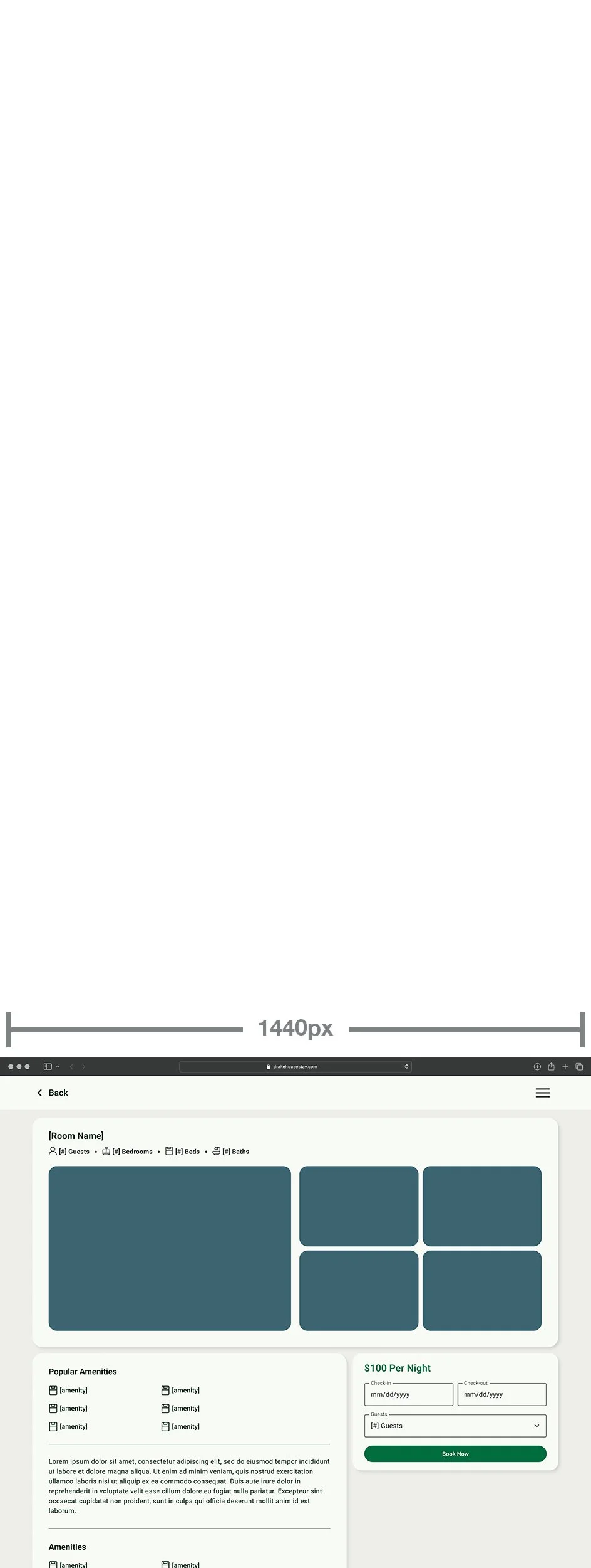
Listing Page
The listing page displays important information above the fold, allowing for easier decision-making and booking.
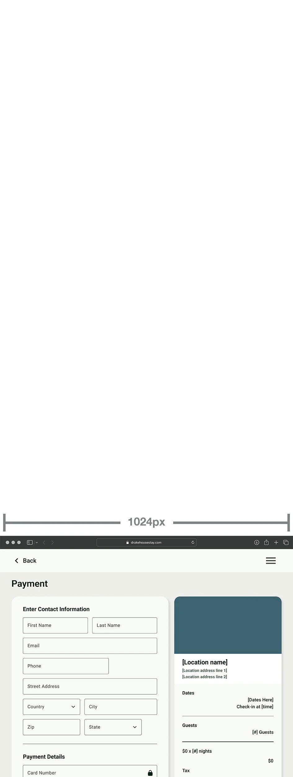
Payment Page
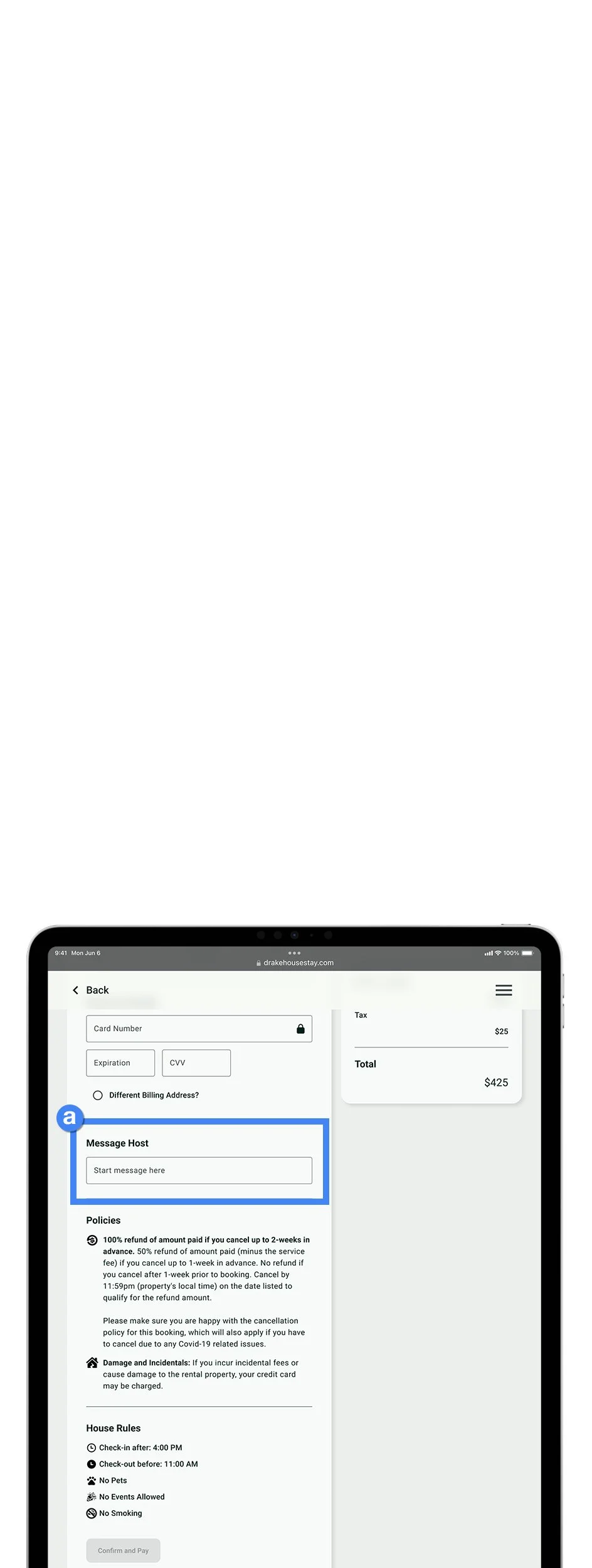
Based on best practices, limiting payment page length is necessary to increase completion rates.
Low-Fidelity Prototypes
User Testing
Usability Study
While observing the Drake House team, I noticed they could navigate through all three website sizes using a single prompt - "book a room." As I watched them interact with the prototype, I took note of their feedback, which helped to identify some crucial changes that needed to be implemented in the high-fidelity designs.
Key Insights from Study
Change the button text from "Search" to "Book Now" for clarity.
Allow users to leave a message on the payment page for the host.
Add customer reviews to the bottom of the room pages.
Refining the Design
High-Fidelity Mockups
With usability insights from the low-fidelity prototype, leveraging components and guidance from Google's Material Design System, and integrating photography and copy from Drake House's existing website, I was able to add a final polish to the new Drake House pages.
High-Fidelity Prototypes
Responsive Flow
With Figma's powerful auto layout tool and the Breakpoints plugin, I simulated the website's responsiveness across all screen sizes. This was essential for the client to see and for developers to work with.
Impact
Drake House's new site would allow its customers to secure a rental directly with them without sacrificing the accessibility, security, and convenience of booking through popular sites such as Airbnb.
Design System
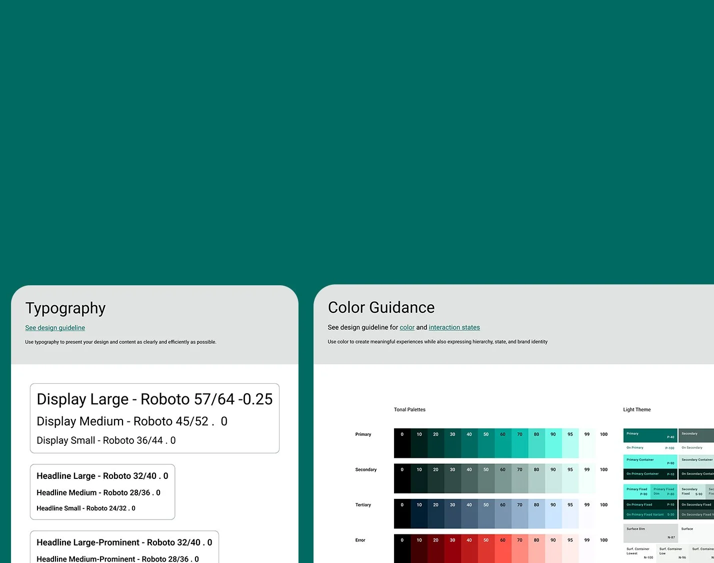
Google Material 3
Starting with the Material 3 design system improved my digital wireframing fidelity and ensured style, component, and compliance consistency.
Component Library
I created parent components for almost everything on the screens and organized them to make universal changes quickly and efficiently.
Moving Forward
Next Steps
I have received approval from Drake House to investigate the expenses and time required to implement the proposed website update. I have shared the high-fidelity prototype with one of my partners, and we will collaborate on determining the specifics and preparing a proposal to proceed.
Reflection
The guidance the owners and management provided throughout the UX process proved immensely beneficial. It assisted in making informed design and layout choices that catered to the needs of their customers. Furthermore, it helped me better understand how to build a checkout flow that can offer users an experience similar to other platforms.
